Call-To-Action (CTA) – 7 ways on how to use it effectively
Wondering how you can boost your click-through rates of your emailers, increase the sales of your e-commerce store, or enhance the conversion rate of your website? In other words, how can you accomplish a win-win situation?
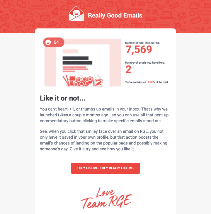
A Call-to-Action (CTA) is used to allow a reader to perform the required action that will fulfill the main objective of the marketing content or channel in question. Some tips of CTAs are the Buy now button which is placed on online stores or Learn more links on articles or newsletters.
In the digital marketing context, they are regularly referred to as Call-to-Action buttons, as they will in general be intended to stand apart from the rest of the content. The button is typically clearly noticeable, and it regularly has an eye-catching teaser text.
What are the main points to consider when utilizing and fine-tuning Call-to-Actions? Go through these 7 tips to understand better:
1. Design for a specific context
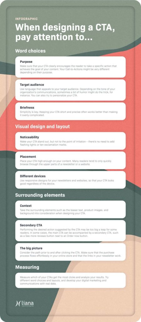
Wondering where to place your CTA? Whether it is a newsletter, an ad, a landing page, or an online store, the CTAs could have different requirements for various channels. It is, therefore, crucial to design your CTA button to really stand out from the other parts such as content and design.
For newsletters, the consistency between your CTA copy and the introduction text may affect your CTA’s proficiency to a great deal. For online stores, on the other hand, the most significant factor might be the clear visual plan of the button, as the items on a site are often surrounded by pictures, descriptions, and different components.
Always consider the specific context when designing your CTA.
 2. Optimize for various devices
As per Statcounter, mobile users make up over half of all web traffic today. Make sure that your CTA is improved for various gadgets, for example, cell phones, tablets, or desktops.
Utilize a responsive design for your newsletters and sites, so your CTA looks great regardless of the device. Ensure that the button fits screens of various sizes, while ideally keeping the plan something similar.
3. Various Call-to-Actions for various purposes
Consider the following: What is the primary objective you need to accomplish with your CTA in this particular context? Is its aim to build your blog’s traffic, sustain a lead on the buyer’s journey, or maybe get criticism on a product or a service?
Your Call-to-Actions may be altogether different depending upon their motivation. In many cases, you should direct away from the most generic ones, for example, Learn more.
4. Know your audience
Who is the audience you need to get a response from? What might trigger them to register?
Offer incentives like quality content for the reader and get innovative. Observing upon your intended target audience interest and manner of actions, sometimes a bit of humor might do the trick, for example.
 Using personalization in your CTAs can make them more viable. The present innovation offers different kinds of chances for marketing automation and triggered communication. With the help of innovation, you can have different Call-to-Actions relying upon which channel the individual came from, and what their activity was before seeing your CTA.
 5. Brief & noticeable CTAs
Keeping your CTA’s short and exact often works better compared to making it excessively complicated. This additionally will in general make the design more clear, and allows you to fit the button on a single row.
Make your CTA stand out, but not to the point of irritation – there’s no requirement to add flashing lights or ten exclamation marks. However, we do recommend you give close consideration to the colors and also the design as well as the surroundings of your button.
Does it pop out enough or are there so many distractions on the site which might divert or confuse your audiences? Do the surrounding elements like product details and images support the CTA?
In addition, give careful thought to the arrangement of the CTA. Numerous readers keep an eye on quickly browsing the upper parts of a newsletter or a website. Because of this, your CTA should be placed sufficiently high on the email or site page.
You can run a heatmap investigation of your site or landing page to track down the best arrangement for your CTA. This should be possible, for example, with Hotjar or VWO.
6. Consider a secondary CTA
Performing the required action proposed by the CTA might be too big a leap for some readers. At times the primary Call-to-Action can be joined by a secondary CTA, for example, a ‘See More’ review button next to an ‘Order Now’ button. The secondary CTA button is often planned such that it separates it from the main CTA by using different graphics or colors.
You should even reintroduce the primary Call-to-Action later on to those readers who chose to click on the secondary option. With the help of this, you can convince your potential customers to perform the required action like making a purchase after all, rather than bouncing off from your website.
 7. Analyze and double-check the path
At the point when you’re evaluating the effectiveness of your Call-to-Action, it’s essential to consider the path that leads to it. What were the actions prior to seeing the CTA? Is the way tempting enough to make your intended audience perform the desired action?
What happens after the CTA button is clicked: does its color change or will the reader be directed to a new landing page, for instance?
You must cover all the perspectives and consider your digital marketing and its channels holistically. For example, if you use a CTA in your newsletter, as a link to a blog, is your website up-to-date and functional? Was the path smooth for the purchaser in your online store?
The Behavior Flow feature on Google Analytics is a great tool for assessing your site clients’ way. Indeed, even a well-made Call-to-Action will not be helpful if technical issues or some other sorts of inconsistencies emerge along the way.
Measure and analyze your results
Get the most out of your digital marketing by measuring and analyzing the performance of your CTAs. Try different word choices, visual elements, and placements and make adjustments based on real data. This allows you to improve your communications and digital marketing.
 Take advantage of your digital marketing by measuring and examining the performance of your CTAs.Try different word choices, visual components, and placements and make changes dependent on real information. This helps you to improve your communications and digital marketing.
For assistance, contact us at [email protected]


